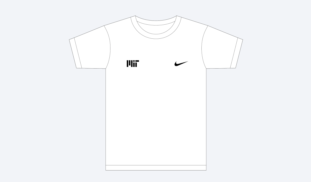
Branded Merchandise
MIT-branded items are a fun way to show pride in the Institute and build community spirit.
To best showcase the MIT brand and ensure that it’s being used consistently and effectively, all MIT departments, students, student groups, and licensees must provide a digital proof of proposed designs for branded merchandise. This includes new or reordered items that will use the MIT logo, MIT seal, Tim the Beaver, or MIT acronym.
Use the contact information below if you have questions or need assistance related to:
- Reviewing proposed designs for MIT-branded merchandise
- Permission to use an MIT mark
- Obtaining high-resolution files of the MIT logo, seal, and Tim the Beaver
- Logo file formats
- Branded merchandise guidelines
- Licensing information (licensees only)
- Appropriate placement of the ® or ™ symbols (licensees only)
Contact information
- MIT departments, labs, and centers: dept-merch@mit.edu
- MIT students and student groups: student-merch@mit.edu
- Licensed vendors: mitmerch@mit.edu
Overview


MIT logo and lock-up

Usage
- The MIT logo is the Institute’s primary mark and should be considered first when creating new merchandise.
- When pairing the MIT logo with the full Massachusetts Institute of Technology name, you must use MIT’s official lock-up. The lock-up is available in three-line and one-line configurations.
- Do not pair the logo with the MIT seal.
- Do not allow zippers or buttons to interfere with the MIT logo or full Massachusetts Institute of Technology name.
- Any design that resembles an official or unofficial mark of the Institute will not be allowed.
MIT’s core palette consists of MIT red, silver gray, bright red, black, and white. While the MIT logo may appear in any color for branded merchandise, we recommend using the core palette whenever possible. Any instance of red should be the official MIT red or bright red.
When applying the logo to apparel, the size of the logo should be no larger than 10'' wide on zippered sweatshirts and no larger than 8'' wide on all other garments.
Be sure to maintain a minimum of 1'' of clear space between the logo and any other graphic or text. In some cases, more than 1'' may be needed depending on the size of the MIT logo and surrounding graphics or text.
Note: There are different spacing requirements when using the MIT logo on communications collateral versus using it for branded merchandise.
Contact mitmerch@mit.edu to request files of the MIT logo.
Do use MIT’s logo files as they are provided to you.
Don’t distress, apply effects to, or otherwise modify the MIT logo.
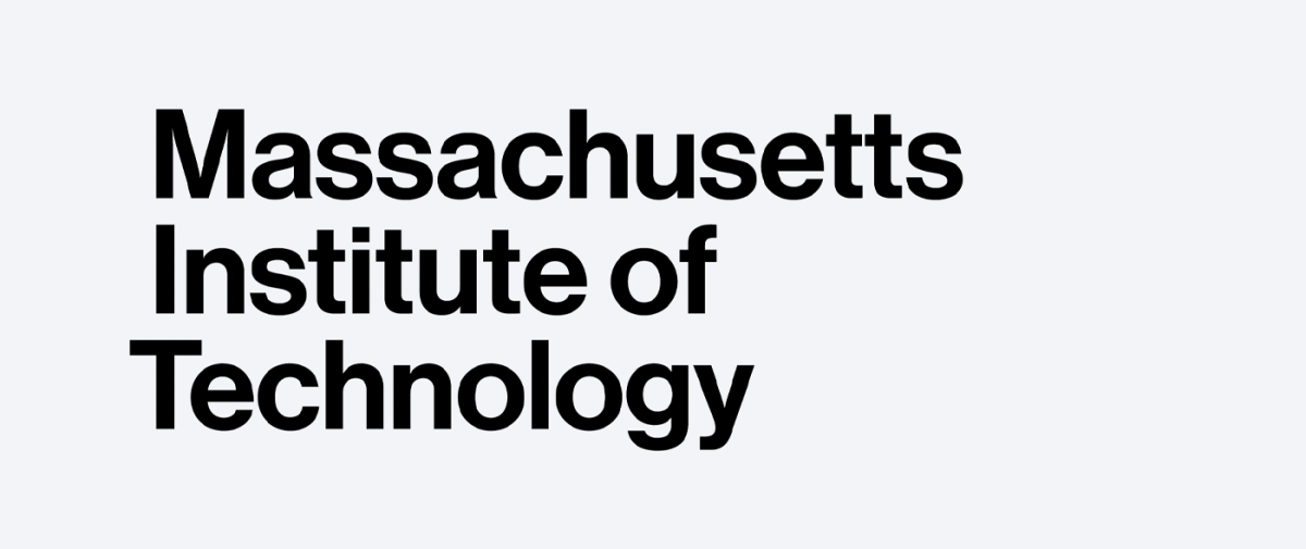
Institute name
Usage
If you use the Institute’s full name independent of the logo, the name can only appear in Neue Haas Grotesk Medium, which is MIT’s primary typeface.
The full name must appear in one of two configurations:
- Single line: The entire name appears on one line.
- Three lines: “Massachusetts” on the first line, “Institute of” on the second line, and “Technology” on the third line.
We recommend using the full name as it appears in MIT’s logo lock-up files.
Contact mitmerch@mit.edu to request files of the MIT logo lock-ups.
Do set the full name in Neue Haas Grotesk Medium, or use the official lock-up logo.
Don’t set the full name in any typeface other than Neue Haas Grotesk Medium.
MIT seal

Usage
- The MIT logo is the Institute’s primary mark and must be considered before the seal when creating new merchandise.
- The seal may only be used by licensed merchandise vendors on products sold at the MIT Coop and other approved retailers. MIT departments and student groups may not use the seal on merch.
- When using the seal, spelling out “Massachusetts Institute of Technology” elsewhere is optional. The “Massachusetts Institute of Technology” within the seal itself must be legible.
- Do not use a distressed or vintage treatment on the seal.
- Do not pair the MIT seal with the MIT logo.
- Do not fill the seal with a background color.
The seal must be reproduced in one color only. The available colors are MIT red, black, and white.
When applying the seal to apparel, it should be no wider than 5.5'', based on a size medium garment.
Carefully consider the manufacturing process when using the seal, since it does not reproduce well when scaled down to less than 2.5" in diameter. Remember that the “Massachusetts Institute of Technology” lettering on the seal itself must be legible.
Be sure to maintain a minimum of 1'' of clear space between the seal and any other graphics or text. In some cases, more than 1'' may be needed depending on the size of the seal and surrounding graphics or text.
Contact mitmerch@mit.edu to request files of the MIT seal.
Do use one color for the seal.
Don’t use multiple colors or fill the seal with a background color.
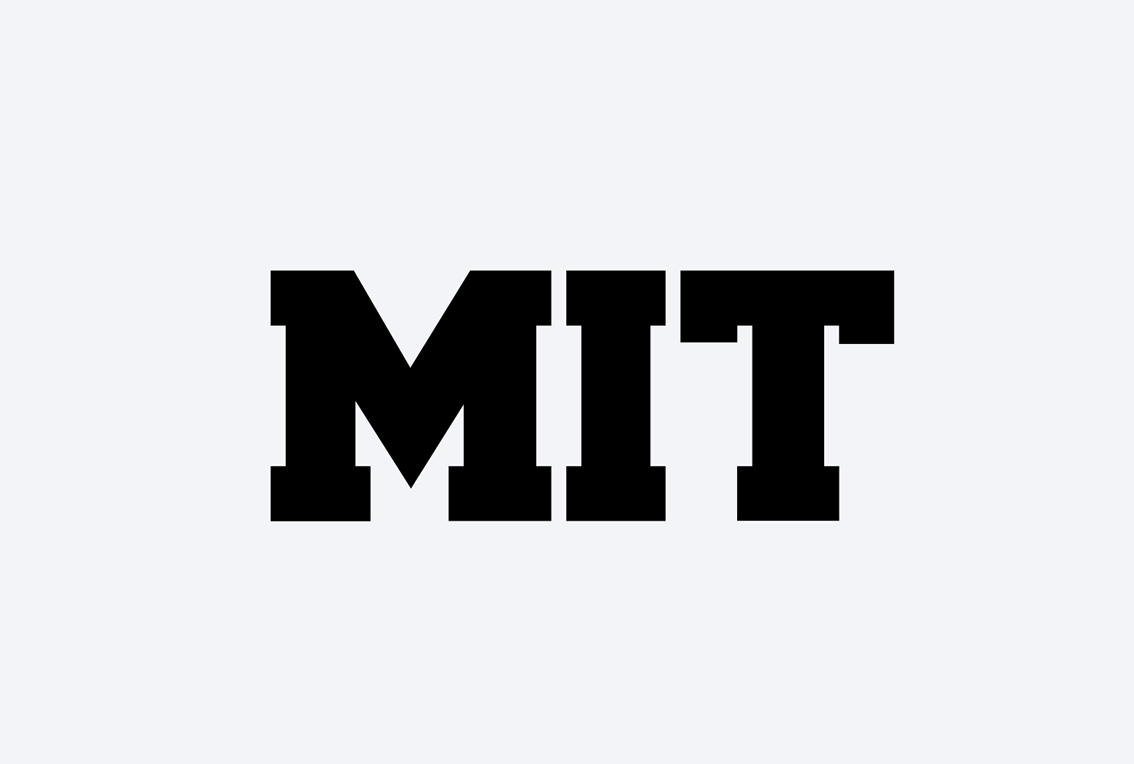
MIT acronym
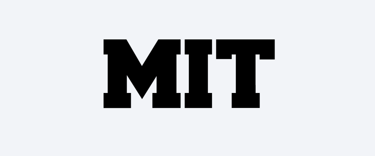
Usage
- The MIT logo is the Institute’s primary mark and must be considered before the acronym when creating new merchandise.
- When using the MIT acronym, licensees should use the Collegiate Style/Athletic Block typeface only. MIT departments and student groups may use other typefaces, but designs must still be submitted for review and approval.
- The MIT acronym should not include periods between the letters.
- When using both the seal and the Collegiate Style/Athletic Block letters on one product, be sure to place the seal under the acronym and scale the seal 30% to 40% smaller than the letters.
- When spelling the acronym vertically, letters should be rotated as a unit and should not be stacked on top of one another.
- Any instance of red should be the official MIT red or bright red.
Do use the Collegiate Style/Athletic Block typeface for the MIT acronym.
Don’t use any typefaces other than Collegiate Style/Athletic Block.
Co-branding
Usage
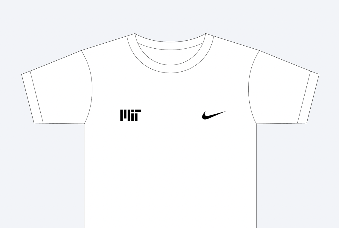
- Carefully consider the amount of space between the MIT logo and the logo of a clothing manufacturing company. The two logos must not be paired or placed closely together.
- MIT will consider all requests for co-branded merchandise but reserves the right to approve or deny them on a case-by-case basis.
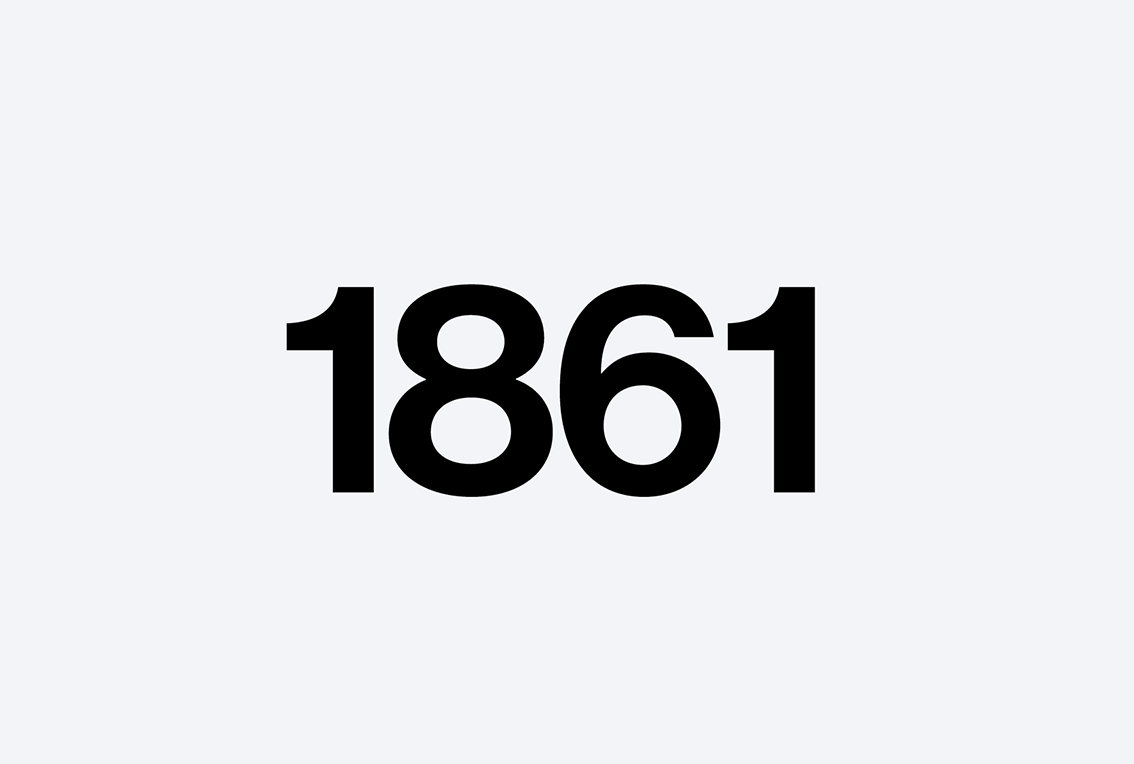
1861
MIT was established in 1861. The year of our founding is often used on branded merchandise.
Usage
- Do not stylize “1861” as this can cause it to take on the look of another logo.
Do use a normal type treatment for 1861.
Don’t stylize 1861 or ’61.
License guidelines
Licensees should review MIT’s license guidelines for details on applying the Institute’s trademarks.