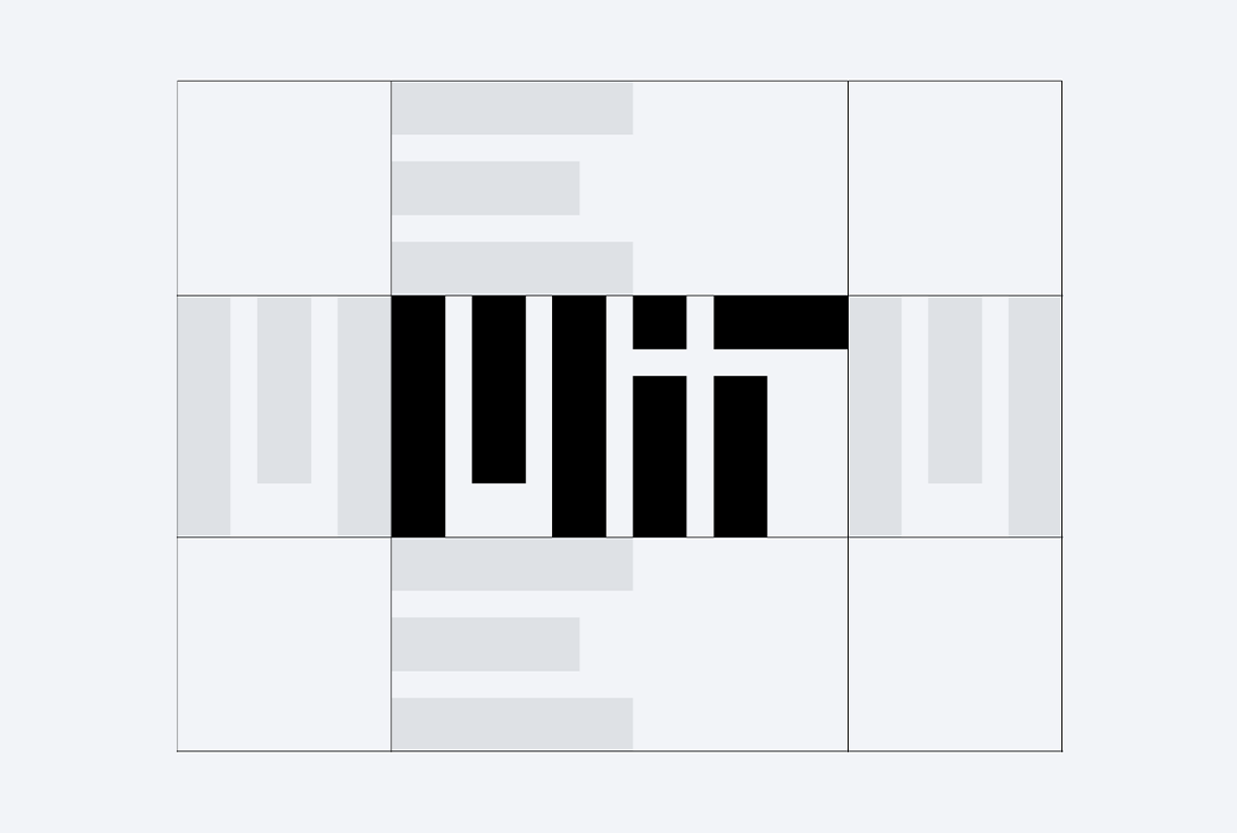
MIT Logo
As the Institute’s primary graphic symbol, the MIT logo should appear on all communications, including websites and other digital collateral, print publications, stationery, and signage.
Logo colors
The MIT logo must appear in any of MIT’s core colors when being used in communications collateral. While any color is permitted when using the logo on branded merchandise, we recommend leveraging the core palette when possible.
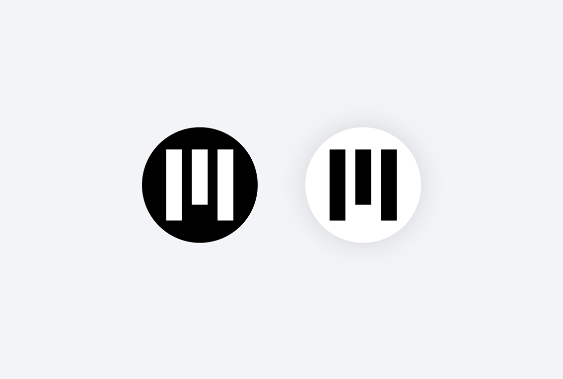
When using the logo on a background color, the logo must appear in either black or white, with the exception of red-on-red treatments.
Red-on-red variations of the MIT logo were designed to express the warmth and vitality of the Institute and are one of the more spirited interpretations of the brand. No other color-on-color uses of the MIT logo are permitted.
There are no restrictions on the use of background colors. If you choose to use colors outside of MIT’s core palette, we recommend using the expanded palette. To maintain legibility, always check that the background color you choose provides sufficient contrast with the MIT logo. The WebAIM Contrast Checker is a free tool for checking color contrast.
MIT logo in the core palette colors
White logo on the core palette background colors
Red-on-red treatments
MIT logo on secondary palette colors
Clear space
To preserve the integrity of the MIT logo, always maintain a minimum clear space around the mark equal to the width of the M in the MIT logo. There may be some instances where additional clear space is needed to ensure that no other graphics or text appear visually connected to the MIT logo. This clear space requirement also applies to the logo-lockups and sub-brand logos.
Note that this clear space requirement does not apply to the MIT logo next to a DLCI logo or wordmark. In this case, more clear space is required; see the endorsed branding guidelines.

Micro logo
The MIT logo has been designed to work across most applications. At very small sizes it requires adjustments to optimize its appearance and legibility, and we have designed a variation for use in small-scale applications. The following size guidelines will help you determine which logo to use:
Standard logo
Print: Use above .25" tall
Digital: Use above 30 px tall
Micro logo
Print: Use .125"-.25" tall
Digital: Use 15 px-30 px tall
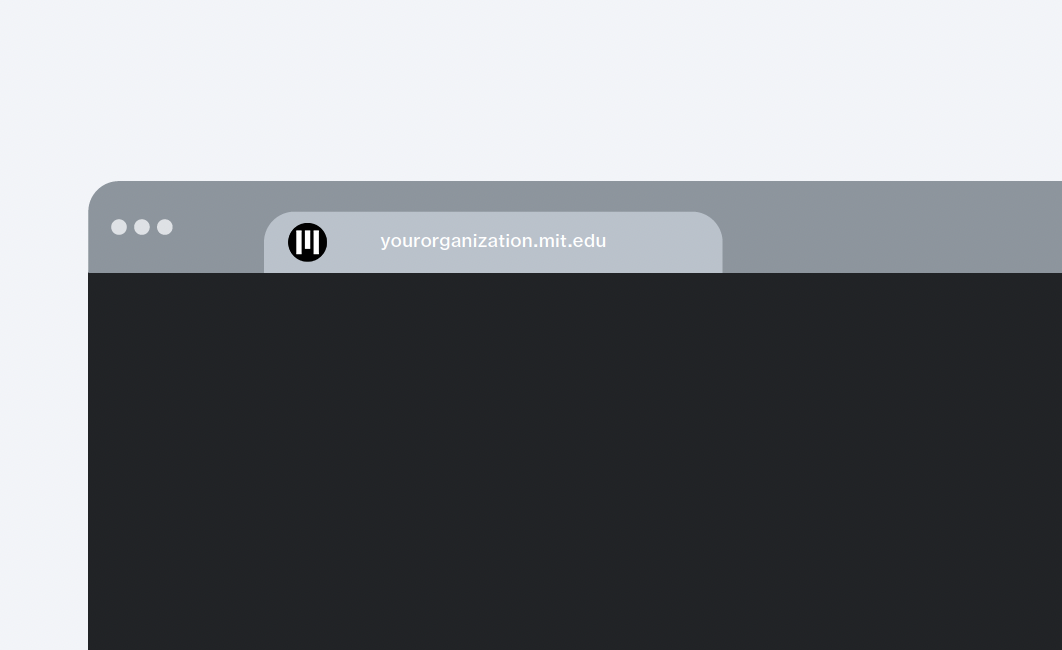
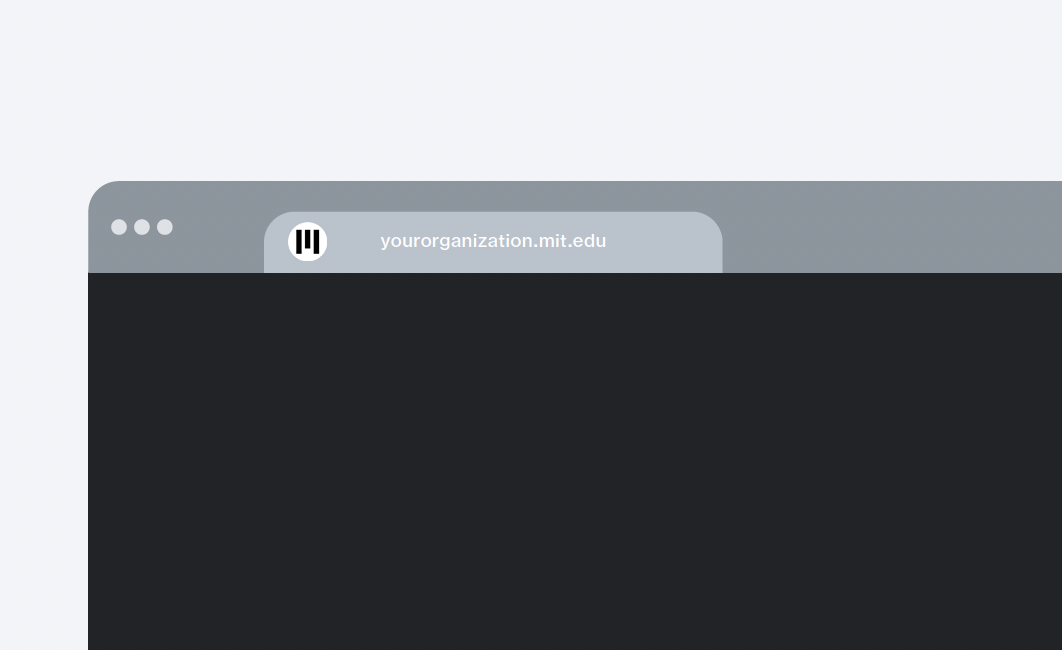
Favicon
Favicons are displayed by web browsers in the header tab or in the browser’s URL bar of your page. The MIT favicon should appear only in black or white.
Placement
On digital communications
Include the MIT logo at the top right of all web pages in desktop, tablet, and mobile views so your site is instantly recognized as being part of MIT. The logo should link to the MIT homepage. If you have a sub-brand logo, place it at the top left and link the entire graphic to the department’s homepage; an MIT logo at the top right isn't needed with a sub-brand logo.
On digital newsletters, include the MIT logo in the header area to indicate your immediate connection to MIT.
For both types of communications, be sure to include the full name of Massachusetts Institute of Technology. You can use the MIT logo lock-up, or you can place the full name in text in the footer contact area of your website or digital newsletter.
On print materials
On print materials, the logo should be in the same visual field as your department’s logo, such as on a brochure cover. The logo should be considered from the beginning so its presence in your design will be more effective. It shouldn’t be hidden on the back cover or an interior page.
Be sure to include the full name of Massachusetts Institute of Technology somewhere on your print piece, if you are not using it as part of a logo lock-up.
For certificates, your program’s name or logo should be at the top to indicate that you are the sponsor. It’s permissible to have the MIT logo at the bottom. If an outside institution is involved with your course or program, see the certificates for joint programs section for guidance.