History
MIT has a rich visual history that few institutions of higher learning can match. Our brand is designed to celebrate and build on this proud legacy.
From traditions established in the years after our founding, to innovations that take advantage of ever-evolving communications technologies, MIT has built a graphic identity that is not only distinctive but uniquely suited to our character and spirit.
The beginnings
Some elements of MIT’s visual brand have a surprisingly long history. The official MIT seal was adopted in 1864. The use of cardinal red and silver gray can be traced to 1876. The industrious beaver was chosen as our mascot in 1914, although he wouldn’t be named Tim until decades later. And beyond these core elements, members of the MIT community have, over years and decades, invented and reinvented countless ways to express the Institute’s characteristic reputation for ingenuity and playfulness.
The moderns
MIT’s visual brand made a dramatic leap forward midway through the 20th century. A handful of talented designers—Muriel Cooper, Jacqueline Casey, Dietmar Winkler, and Ralph Coburn—worked together at MIT’s Office of Publications starting in the 1950s and continuing into the early 80s. Early on, an exchange student from Switzerland named Thérèse Moll introduced them to a new typeface called Helvetica. This clean, rigorous san serif was very much at odds with the traditional fonts then in use at other universities. It quickly became a favorite of MIT’s designers, who combined its clean European minimalism with an American sense of joyful imagination, creating a new “MIT style” that came to be admired around the world.
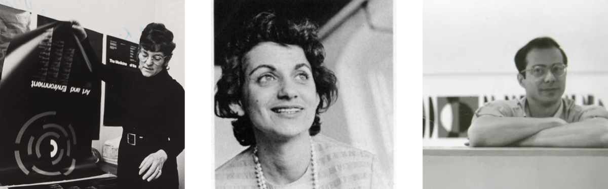
From left to right: Jacqueline Casey, Muriel Cooper, and Ralph Coburn. Images: Calvin Campbell, courtesy of MIT Museum; MIT Press; courtesy of the estate of Ralph Coburn, David Hall Gallery, LLC
The logo
Although MIT entered the 21st century with a well-earned reputation for design excellence in its printed—and increasingly digital—communications, it still lacked a standardized way of using its acronym as a logo. Around the turn of the century, a team of MIT staff and a group of consulting designers, working with the legendary type designer Matthew Carter, devised the careful combination of seven squared-off shapes that was launched as our official logo in 2003. Bold and functional yet provocative and even quirky, it reflects the unique character and spirit of the Institute. For more background, see an MIT student’s deep dive into the history of MIT’s logo and graphic identity.
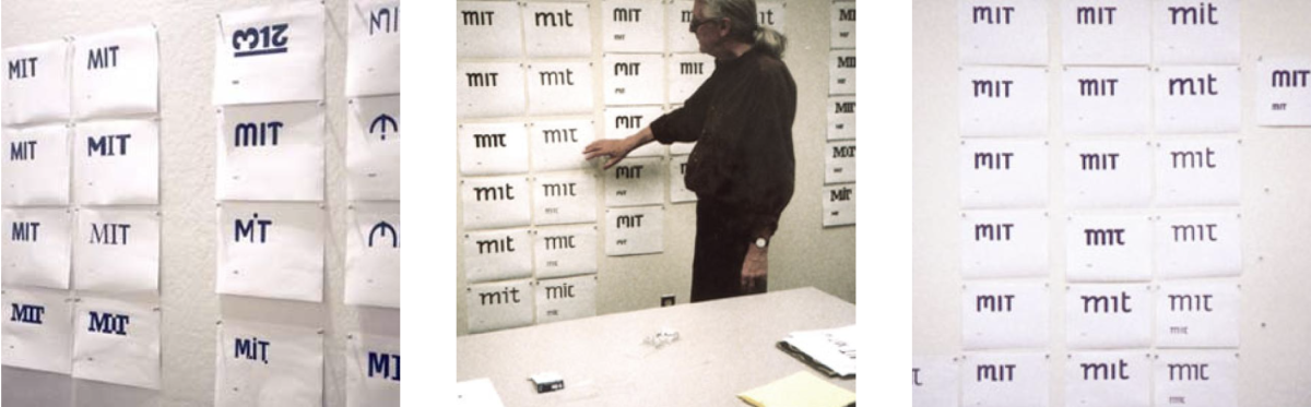
Design exploration during the creation of the MIT logo, launched in 2003. Type designer Matthew Carter, who led the creative team, is in the center photo. Images: John Kramer
A living brand
The visual identity of today’s MIT brings together these elements from our rich history and allows us to deploy and leverage them within an increasingly complex communications ecosystem. The brand is a toolkit that works in multiple mediums, at dramatically different scales, across a wide array of technologies, all accessible to a broad and diverse audience.
We continue to honor the traditions established more than 150 years ago, while constantly seeking new ways to communicate the MIT message that will surprise and delight. We hope these guidelines provide not just tools but inspiration to all of us who work together to build the MIT brand.
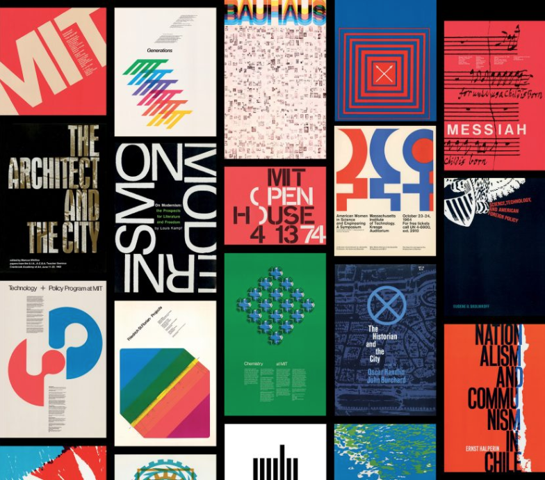
A collage of designs by Muriel Cooper and Jacqueline Casey. All Casey images from the Architecture and Design collections of the MIT Museum. All Cooper images from the Muriel Cooper Papers, Archives and Special Collections Department, Massachusetts College of Art and Design.