Color
Our brand colors connect us to our history, and bring energy and consistency to our communications. MIT’s core colors are supported by a new secondary palette that modernizes our brand and allows for a greater range of expression.
Core palette
Our legacy colors, MIT red and silver gray, were first adopted in 1876. Our core palette also includes bright red, black, and white. Consistent use of these colors helps strengthen the MIT brand, and we strongly recommend including at least some of them in your communications.
| Color Name | Web | Swatch | |
|---|---|---|---|
| MIT Red |
Web
RGB: 117/0/20
HEX: #750014 copy hex code |
Print
CMYK: 30/100/95/43
PMS: 202 C and 7427 U* |
|
| Silver Gray |
Web
RGB: 139/149/158
HEX: #8b959e copy hex code |
Print
CMYK: 0/0/0/45
PMS: 7543 |
|
| Bright Red |
Web
RGB: 255/20/35
HEX: #ff1423 copy hex code |
Print
CMYK: 0/90/85/0
PMS: Red 032 |
|
| Black |
Web
RGB: 0/0/0
HEX: #000000 copy hex code |
Print
CMYK: 0/0/0/100
PMS: Black |
|
| White |
Web
RGB: 255/255/255
HEX: #ffffff copy hex code |
Print
CMYK: 0/0/0/0
PMS: N/A |
* For optimal results, we have two MIT reds for printing spot color: PMS 202 C for coated paper and PMS 7427 U for uncoated paper. Work with your printer to ensure you’re using the proper version.
Expanded palette
MIT’s expanded palette is a broad set of colors that provides flexibility and supports a range of creative executions. The expanded palette allows you to be expressive and distinct while also reinforcing the larger MIT brand.
| Color Name | Web | Swatch | |
|---|---|---|---|
| Dark Pink |
Web
RGB: 117/0/98
HEX: #750062 copy hex code |
Print
CMYK: 50/100/0/32
PMS: 2356 |
|
| Pink |
Web
RGB: 255/20/240
HEX: #ff14f0 copy hex code |
Print
CMYK: 0/100/0/0
PMS: 232 |
|
| Light Pink |
Web
RGB: 255/179/255
HEX: #ffb3ff copy hex code |
Print
CMYK: 0/32/0/0
PMS: 243 |
|
| Dark Purple |
Web
RGB: 62/0/107
HEX: #3e006b copy hex code |
Print
CMYK: 90/100/0/20
PMS: 2685 |
|
| Purple |
Web
RGB: 153/51/255
HEX: #9933ff copy hex code |
Print
CMYK: 50/65/0/0
PMS: 265 |
|
| Light Purple |
Web
RGB: 191/179/255
HEX: #bfb3ff copy hex code |
Print
CMYK: 26/37/0/0
PMS: 264 |
|
| Dark Blue |
Web
RGB: 0/40/150
HEX: #002896 copy hex code |
Print
CMYK: 100/90/0/0
PMS: Reflex Blue |
|
| Blue |
Web
RGB: 25/102/255
HEX: #1966ff copy hex code |
Print
CMYK: 80/50/0/0
PMS: 2727 |
|
| Light Blue |
Web
RGB: 153/235/255
HEX: #99ebff copy hex code |
Print
CMYK: 35/0/0/0
PMS: 304 |
|
| Dark Green |
Web
RGB: 0/77/26
HEX: #004d1a copy hex code |
Print
CMYK: 87/0/100/50
PMS: 2427 |
|
| Green |
Web
RGB: 0/173/0
HEX: #00ad00 copy hex code |
Print
CMYK: 77/0/100/0
PMS: 2271 |
|
| Light Green |
Web
RGB: 170/255/51
HEX: #aaff33 copy hex code |
Print
CMYK: 34/0/78/0
PMS: 2290 |
|
| Yellow |
Web
RGB: 255/235/0
HEX: #ffeb00 copy hex code |
Print
CMYK: 0/0/95/0
PMS: Yellow |
|
| Dark Gray 1 |
Web
RGB: 64/70/76
HEX: #40464c copy hex code |
Print
CMYK: 0/0/0/75
PMS: 7545 |
|
| Dark Gray 2 |
Web
RGB: 33/35/38
HEX: #212326 copy hex code |
Print
CMYK: 0/0/0/90
PMS: 7546 |
|
| Dark Silver Gray |
Web
RGB: 98/106/115
HEX: #626a73 copy hex code |
Print
CMYK: 0/0/0/60
PMS: 7544 |
|
| Light Silver Gray |
Web
RGB: 184/194/204
HEX: #b8c2cc copy hex code |
Print
CMYK: 0/0/0/30
PMS: 5455 |
|
| Light Gray 1 |
Web
RGB: 242/244/248
HEX: #f2f4f8 copy hex code |
Print
CMYK: 0/0/0/5
PMS: 656 |
|
| Light Gray 2 |
Web
RGB: 221/225/230
HEX: #dde1e6 copy hex code |
Print
CMYK: 0/0/0/10
PMS: 650 |
PMS for spot-color printing
CMYK for process-color printing
RGB or HEX code for screen viewing
Hierarchy
Use colors strategically as a way to establish visual hierarchy in your communications.
Meaning
Color can carry deep meaning. Choose colors that reinforce your department’s purpose, vision, and work, as well as the objectives of a specific communication.
Legibility
Combine light and dark colors to create contrast and ensure clarity and legibility.
The colors in MIT’s core palette can be combined in a number of ways. Each combination can subtly impact the overall tone of your design.
For example, MIT red, silver gray, and white feel traditionally “MIT.” Using MIT red in combination with bright red, black, and white feels contemporary while still reflecting elements of MIT’s history and legacy.
When choosing colors from the core palette, consider the overall tone and mood you are seeking to convey, as well as your specific communications goals.
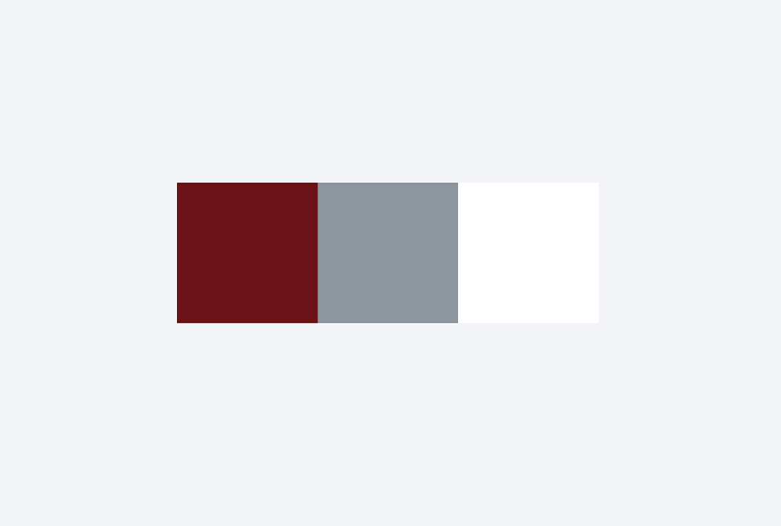
MIT red, silver gray, white
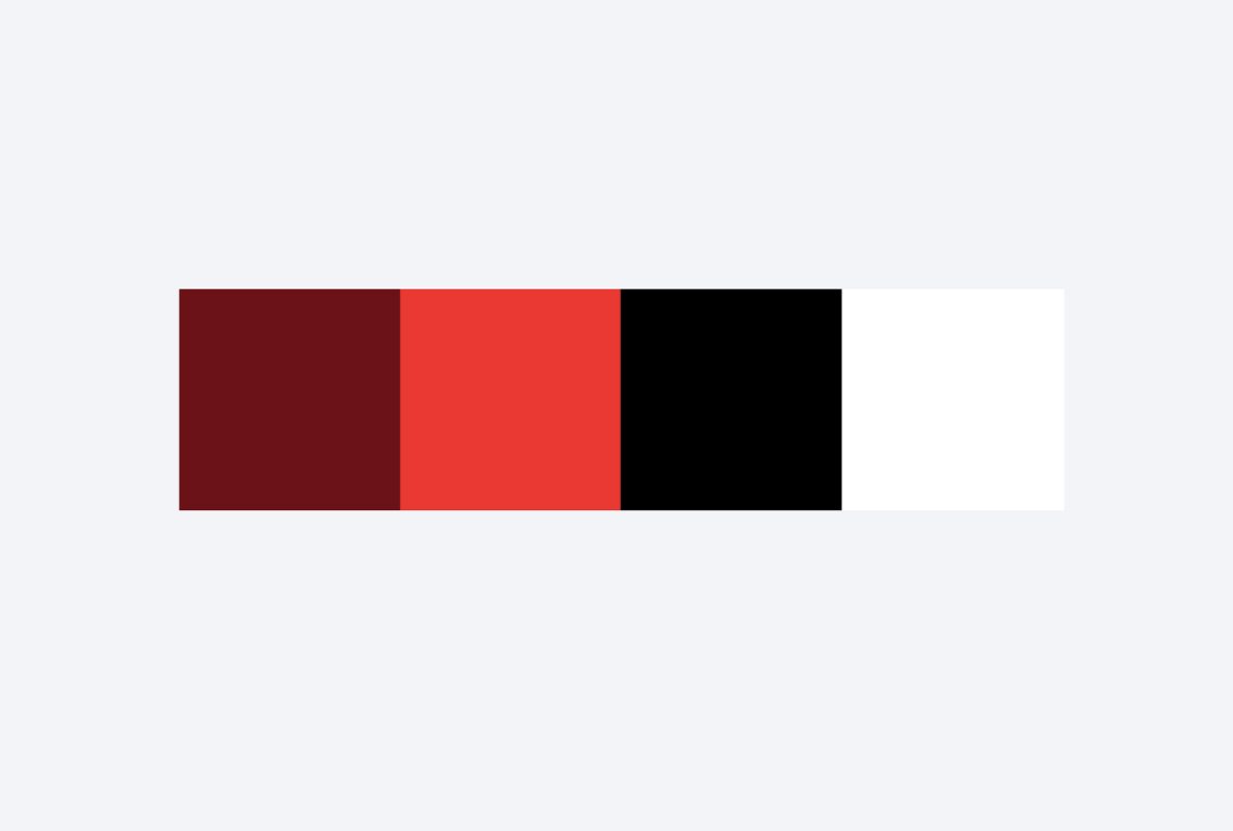
MIT red, bright red, black, white
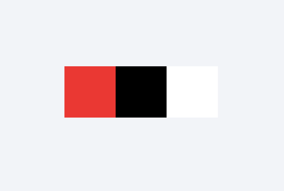
Bright red, black, white
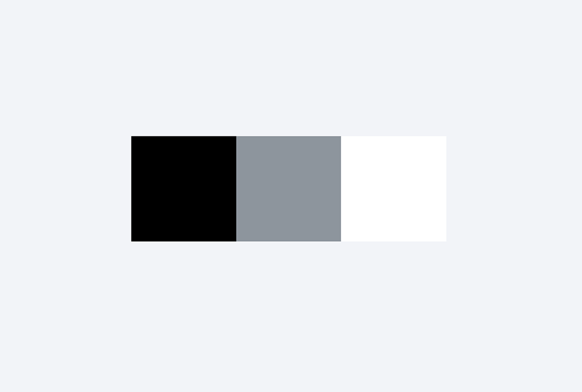
Black, silver gray, white
Including MIT red in your communications helps to reinforce the relationship between your department and MIT as a whole.
But combining colors with MIT red requires careful consideration. MIT red tends to work best with analogous warm colors such as reds, pinks, and yellow. MIT red also works well with complementary cool colors like blues. It’s best to avoid colors that sit in between the warm and cool color range, such as purples and greens.
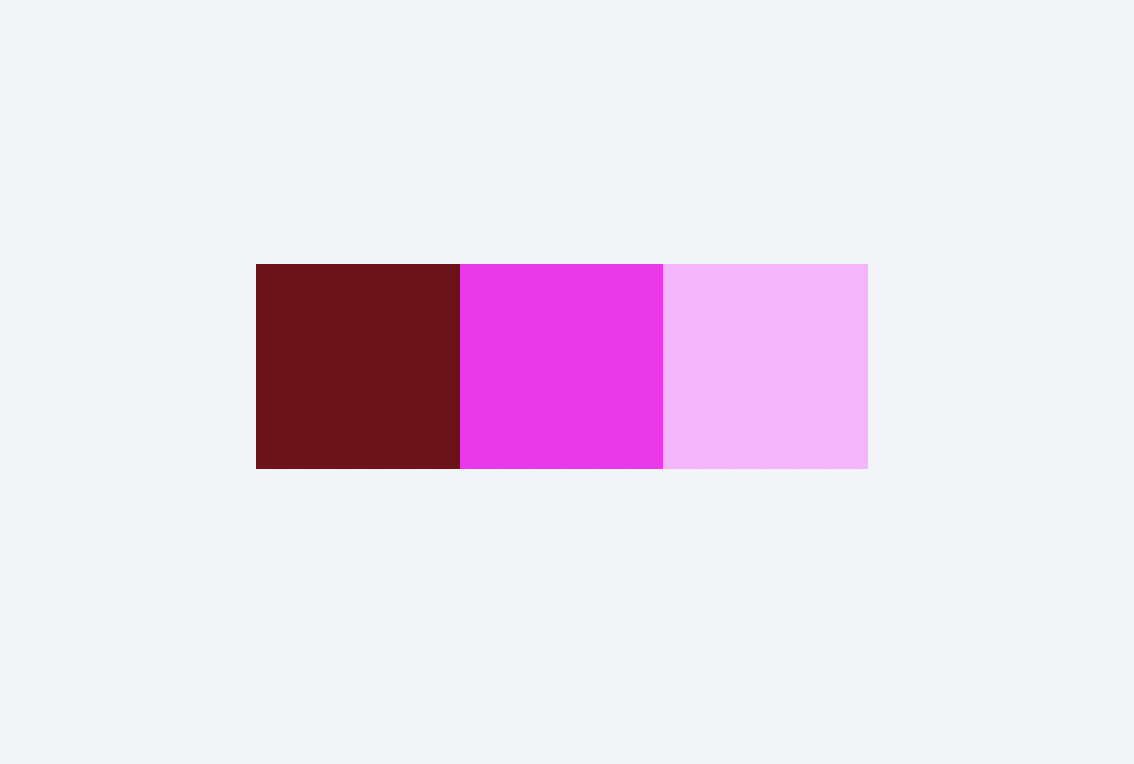
Analogous colors
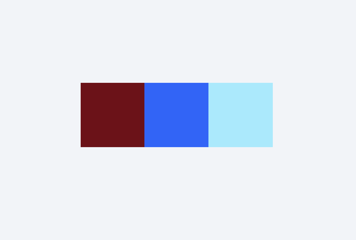
Complementary colors
Color accessibility is important because it ensures that everyone, including people with visual impairments or color vision deficiencies, can perceive and distinguish information presented in various color combinations.
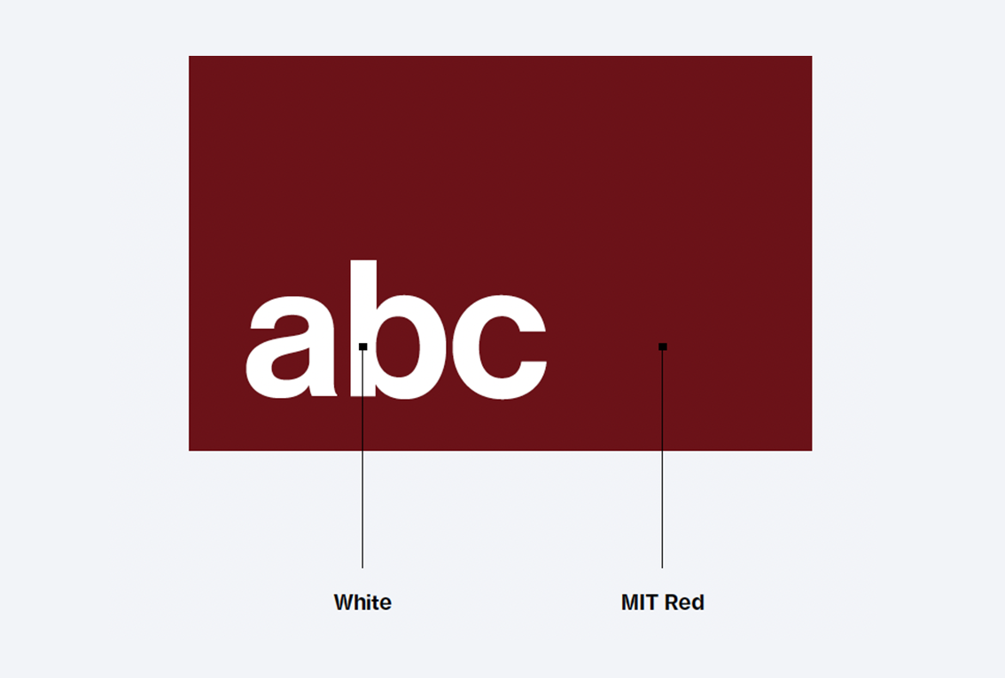
Color contrast
Color contrast is defined as the difference between two colors when they are placed next to each other. It is important because it affects legibility and readability of text, as well as the overall comprehension of content for people with visual impairments or color vision deficiencies.
Contrast is typically measured using what’s known as the contrast ratio, a numerical value that represents the relative difference in luminance (brightness) between two colors. The contrast ratio is calculated by comparing the luminance of the foreground color (such as text) to that of the background color (such as the background of a webpage).
Sufficient color contrast
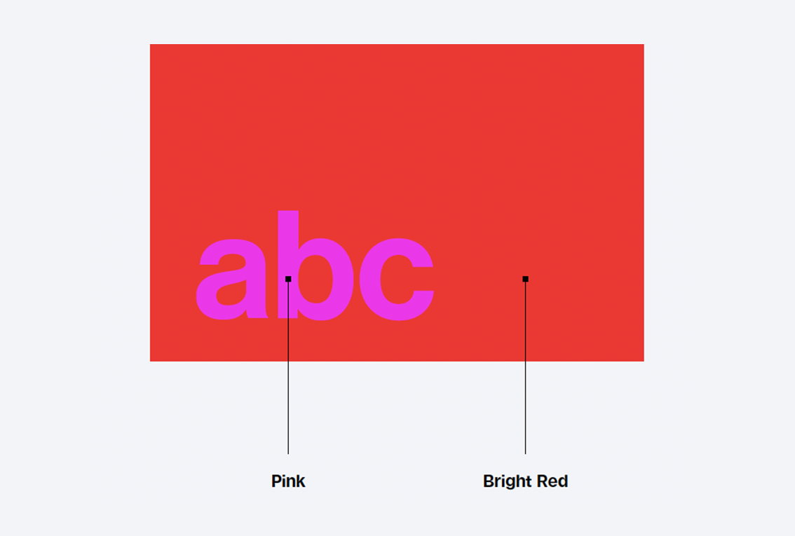
Insufficient color contrast
Contrast requirements
The Web Content Accessibility Guidelines (WCAG) provide specific criteria for contrast ratios to ensure that text is easily readable for a wide range of users. The current WCAG 2.1 standard recommends a minimum contrast ratio of 4.5:1 for normal text and 3:1 for large text (typically 18 pt or 14 pt bold). For enhanced accessibility, the WCAG AAA level requires a contrast ratio of 7:1 for normal text and 4.5:1 for large text.
By ensuring sufficient contrast between foreground and background colors, we make it easier for all users to perceive and understand the information being presented.
Accessibility resources
MIT Disability and Access Services can offer guidance on accessible web design and code.
The WebAIM Contrast Checker is a free tool for checking color contrast.