Typography
Typography is an important and high-visibility part of the MIT brand. Our typography emphasizes clarity and legibility, and reinforces the brand’s key elements.
We suggest using our brand typefaces to further reinforce the connection to MIT and help create a unified look and feel. These typefaces are available to the MIT community at no cost.
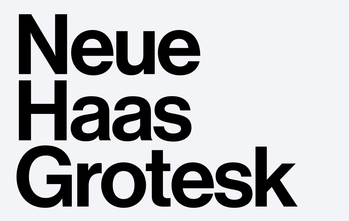
Neue Haas Grotesk
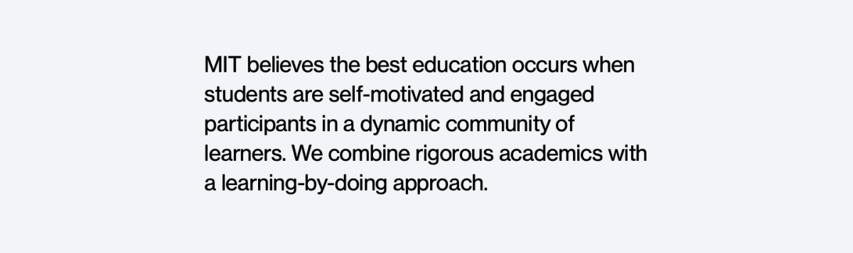
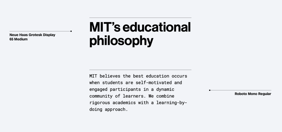
MIT’s primary typeface is Neue Haas Grotesk, also referred to as NHG. Designed in the late 1950s, it became extremely popular around the world and was seen by many as a symbol of modernist graphic design. The typeface was later renamed Helvetica.
Due to its immense popularity, many versions of Helvetica – some of them poorly crafted digital interpretations – have been developed over the years. The version of Neue Haas Grotesk used for the MIT brand is not the same as today’s Helvetica: it is a sophisticated digital revival of the original Helvetica design that reflects the quality and fidelity of its original shapes.
We strongly recommend using NHG for all professionally designed communications. For internal communications, such as MS Word docs and PowerPoint presentations, Arial can be used as an alternative because it's compatible with both Macs and PCs. Our templates were built with Arial.
The MIT community can access Neue Haas Grotesk through Adobe Fonts.
NHG Text vs. Display
To optimize its appearance and readability within various size ranges, there are two variations of NHG available: Display and Text.
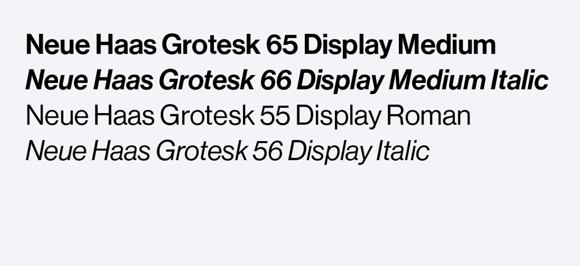
NHG Display styles
Digital use: larger than 20 px
Print use: larger than 16 pt
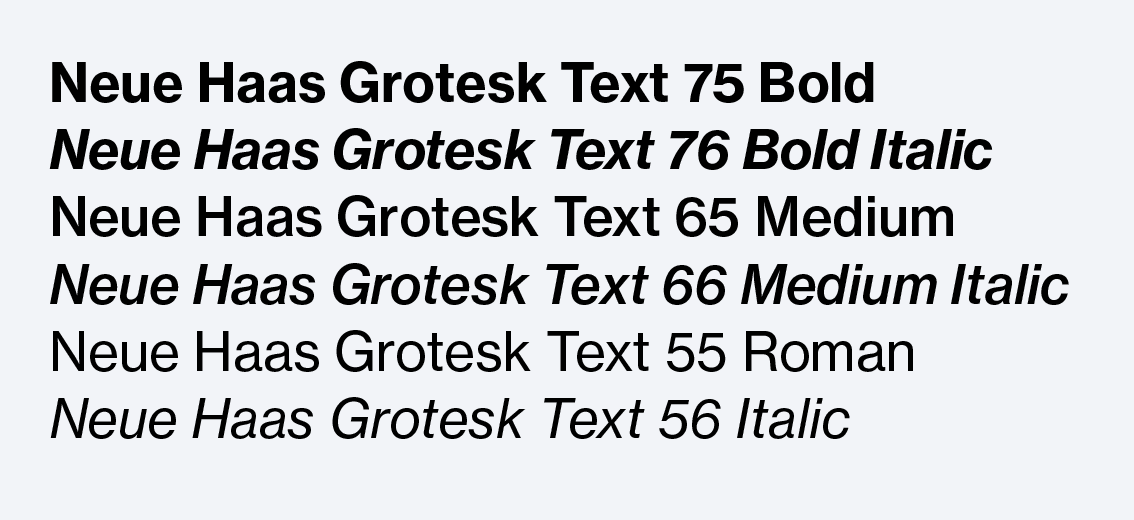
NHG Text styles
Digital use: 20 px and below
Print use: 16 pt and below
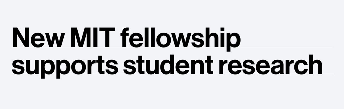
At large sizes, NHG looks best with tight leading, which gives the typography greater impact. As a rough guide, leading should fall somewhere between 85% and 100% of the type size. Use this range as a starting point, but always optimize based on the application.
Smaller text tends to require more leading than headline typography. As a rough guide, leading should fall somewhere between 100% and 125% of the type size. Use this range as a starting point, but always optimize based on the application.
Pairing typography with NHG
Neue Haas Grotesk can be effectively paired with several other typefaces, and works well in both a leading and supporting role. The key is to choose a companion typeface that provides sufficient stylistic contrast.
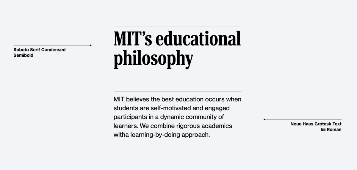
Secondary typefaces
There are several text and headline typefaces that work well with Neue Haas Grotesk. These typefaces may be used in whatever weight and style is appropriate to your communications. All of them are available to the MIT community through Adobe Fonts or Google Fonts.
When choosing typefaces, be sure to consider:
- Legibility and readability: Pick a font that is clear and easy to read for its intended application.
- Personality: Select a typeface that aligns with your communications goals and conveys the right message.
- Design context: Ensure that your typeface choices work well with other design elements included in your communications.
Headline typefaces
Text typefaces
How to access MIT’s typefaces
MIT’s typefaces are available to the MIT community at no cost. MIT has an Adobe Creative Cloud enterprise license for staff, faculty, and students. Note that when you activate Adobe Fonts, they become available on all of your desktop apps, not just Adobe products.
Access through Adobe Fonts:
- Neue Haas Grotesk
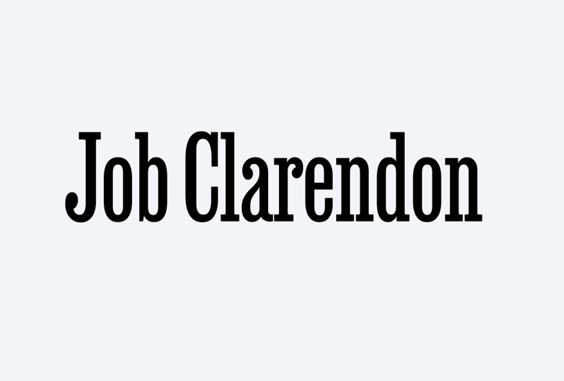
- Job Clarendon
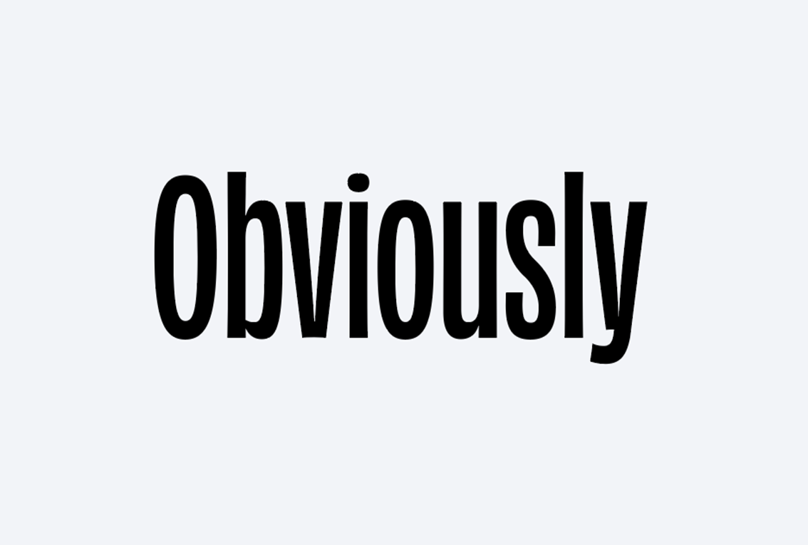
- Obviously
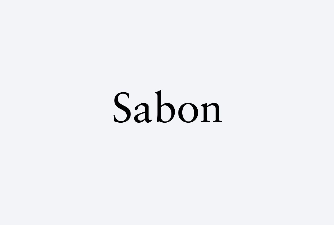
- Sabon
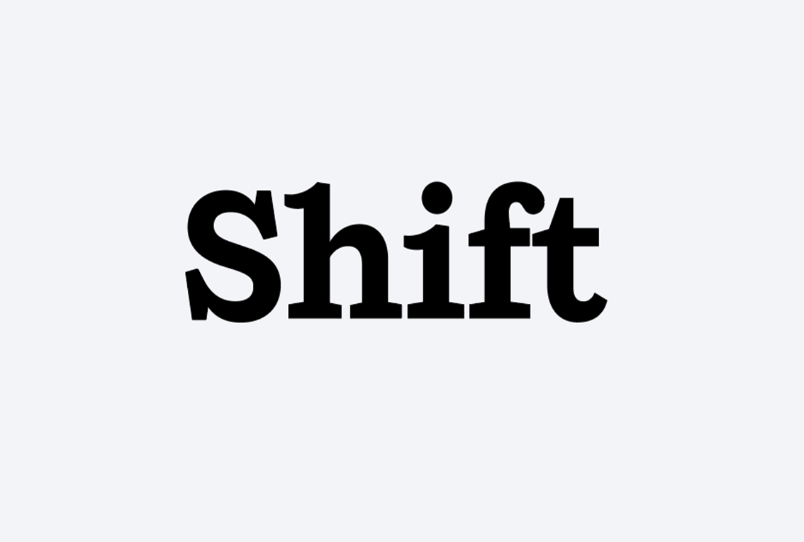
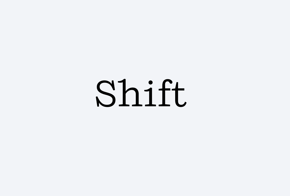
- Shift
How to activate:
- Open the Creative Cloud desktop app. (Select the Creative Cloud icon in your Windows taskbar or macOS menu bar.)

- Click Manage fonts in the left sidebar.
- Click Browse more fonts at the top right.
- You’ll be prompted to log in to the Adobe website.
- Search for the font and click the Add Family button.
- In the Manage fonts in the Creative Cloud app pop-up window, click the Open app button.
- Once back in the app, select Install family.
See the Getting and Using Fonts section of Adobe’s user guide if you have questions.
Affiliates are not covered by MIT’s Creative Cloud license. Departments, labs, and centers can purchase a license for an affiliate.
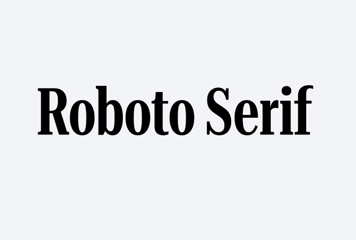
Free access through Google Fonts:
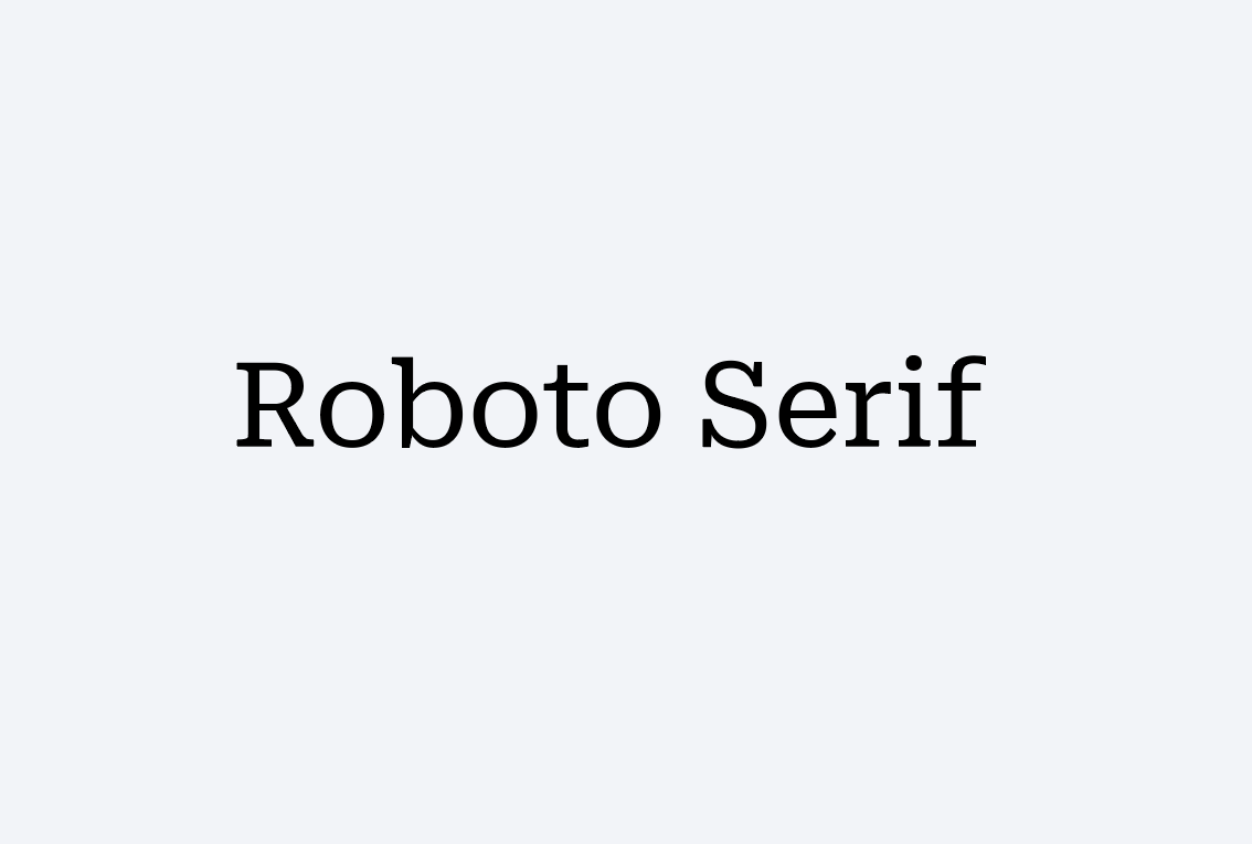
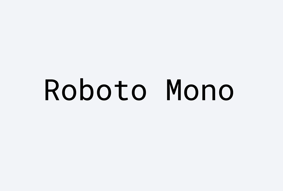
- Roboto
How to access:
- Go to Google Fonts.
- Click the Roboto fonts you want to install.
- Click the Download family button at the top right of the page.
- Open the downloaded .zip file, which contains a folder with fonts.
- In the folder, select all .tff font files.
- On Mac, double-click the selection and click the Install Font button in Font Book. On Windows, right-click the selection, choose Open in the context menu, click Install within each window, and then close.
- Restart your computer if the fonts do not appear in your software immediately.